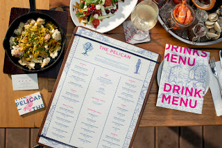
Critique: Aside from the fact that the main information is center aligned, this is a really attractive menu. Hot pink and navy blue is a classic color combination that seems almost forgotten, and this design brings it back in an intelligent way. I most love the intricate border and how the same design is carried over onto the various mini-menus of the restaurant. The design uses line to frame and organize the copy really well, and even though there's a lot of information, nothing gets lost. This is definitely another favorite.
Typgraphy Research
Wednesday, November 20, 2013
Menu Research: Bean & Berry
Bean & Berry Menu:
Critique: Overall, the menu seems a little plain, but it works for the general, old world theme. The illustrations seem a little floaty in places, but could be easily reworked into the flow of the design. I think what's really throwing me off are the slanted divider lines. There's a love-hate feeling I'm having with them. While they make the menu more interesting and create movement, they just feel too heavy and are distracting. It might help just to make them thinner. Aside from that, the bold, inverted headers were a great idea to add balance between the information and heavy border, and the information had a nice readability and is kept simple in its organization.
Menu Research: Dressage | Brand Identity
Dressage Menu:
Critique: At first, I thought I was really into this design, but when I started to try and explain why I liked it, I couldn't think of what to say. Overall, it's just uninspiring. It offers the information well enough, it's easy to read through and there's nothing overly complicated about it. However, there's nothing unique to set it apart. There's no personal touch to enhance the design, no real style. It sort of feels like a word document. I love the logo and the cover, so incorporating a bit of that could enhance in the inner pages dramatically.
Menu Research: Cafe 76
Cafe 76:
Critique: This is a very cute and homely design that uses a handwriting-styled type to its advantage. Everything feels hand done and personal, so they nailed the overall aesthetic. The use of color to divide information was a nice touch, as well. The cover gives off a brochure feel at first impression, though, and I think that just might be due to the colors used in the illustration's sky. Bringing in the parchment color from the other panels might help it escape from that brochure feel and tie everything together more.
Menu Research: Sweet Chick
Sweet Chick Menu:
Critique: Being a menu that uses strictly typography in it's design, this piece is very attractive. It has so many elements that are being used - from inverted headers, outlined and drop shadowed headers, bold menu items, arched categories - and it still feels extremely organized and tidy. I really appreciate the intricate borders around each category, too. It completes the overall bistro aesthetic.
Subscribe to:
Comments (Atom)


